Graphic Designers: Avoid These 3 Mistakes When Designing for Newspaper Printing
In the fast-paced world of graphic design, where digital platforms dominate the landscape, the timeless art of preparing visuals for newspaper printing often takes a back seat. Whether you’re a seasoned pro looking to refresh your knowledge or a newcomer stepping into the realm of print, here are 3 mistakes to avoid to ensure your designs translate seamlessly to the newspaper page.
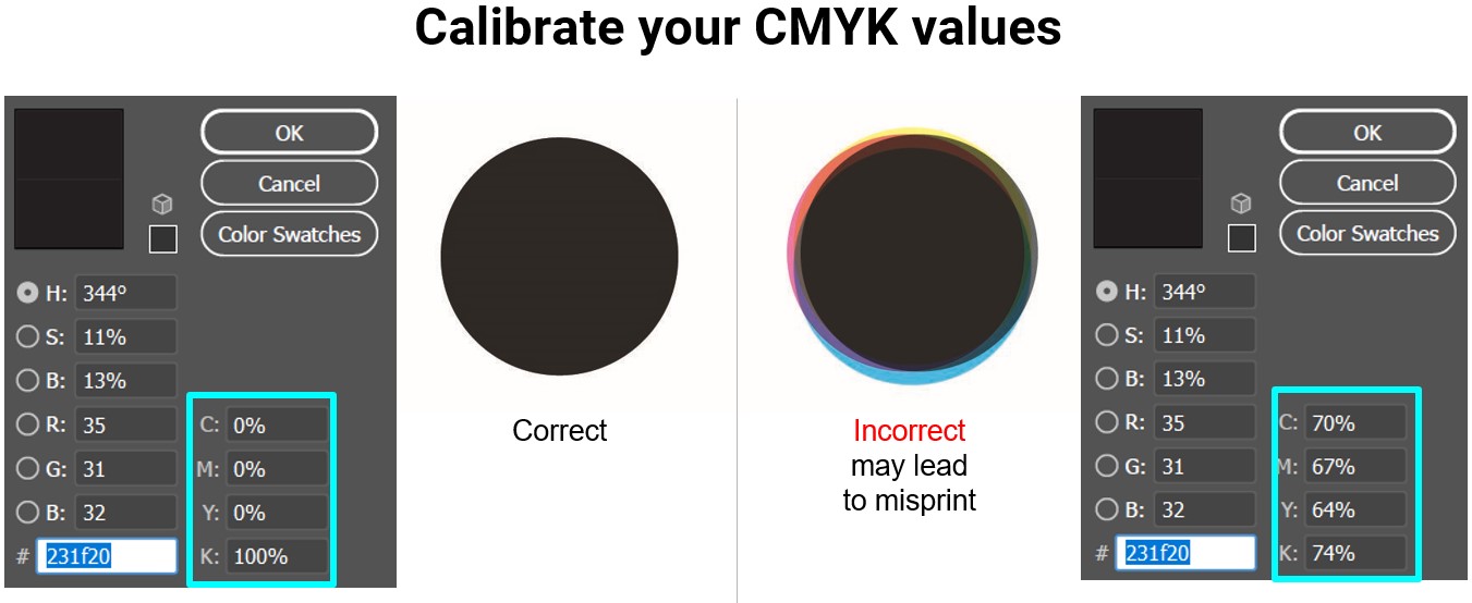
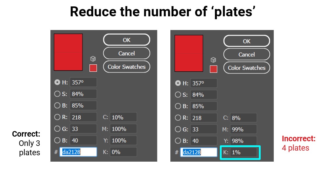
Not Calibrating Your CMYK Values
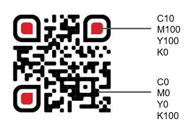
Newspapers are printed using the traditional web-offset press method. During printing, colours are separated into four ‘plates/sheets’: Cyan, Magenta, Yellow, Key (Black). The four plates are aligned and ‘stamped’ onto the same page to form the whole image.
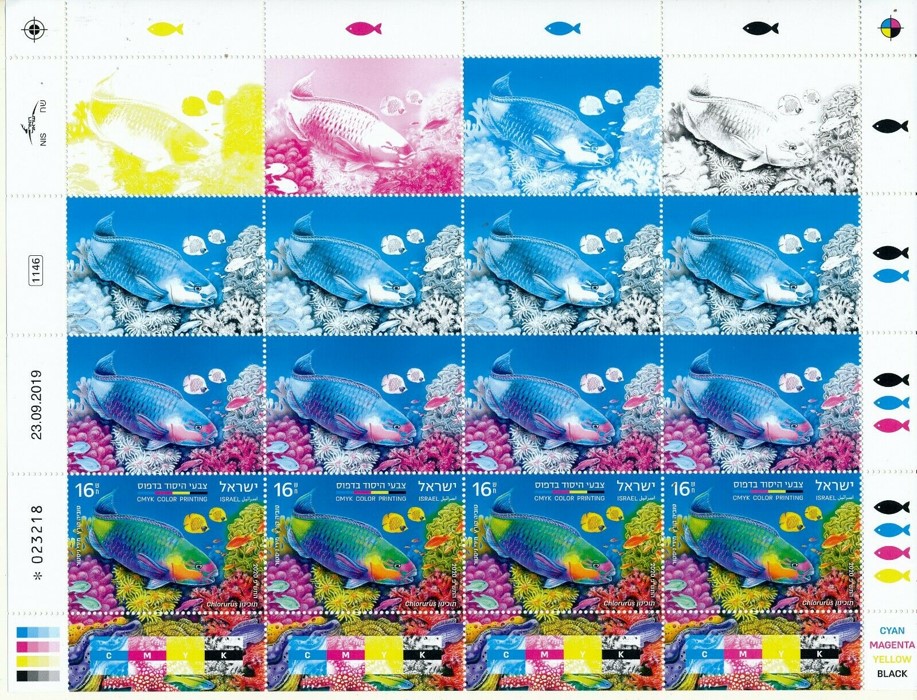
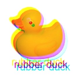
Due to the speed of news printing, misalignment of the plates tends to happen, causing ‘misregistration’, which is this blurry look.
Therefore, it’s essential to check your colours and manually calibrate them to reduce the number of plates used, especially black/dark elements and small text and icons. Simply changing from RGB to CMYK mode is not sufficient.
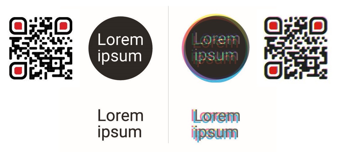
QR Codes That Are Too Small
Misregistration is worse on fine details like QR codes. So allocate sufficient space for them (recommended min. size: 2cm x 2cm) and check the colours. If your QR code comes out misregistered, readers may not even be able to scan it.
Font Sizes That Are Too Big Or Too Small
The body text in most news stories is printed at a size of 8.5. For print ads, sizing the body around 9 – 11 will ensure it’s sufficiently legible. If the text happens to be white against a coloured background, it’s recommended to increase the font size to around 11 – 13. Font sizes around 7 – 8 are usually reserved for fine print and T&Cs. Reducing the font size any further will risk legibility. Larger font sizes around 15 – 18 are usually too big for body text. We recommend using these sizes for subheadings instead.
In conclusion, avoiding these 3 key mistakes in newspaper design is crucial for graphic designers aiming for impactful print visuals and avoiding costly mistakes for the client. By staying mindful of these nuances, designers can ensure that their creations shine on the pages of newspapers, capturing attention and making a lasting impression on news readers.